Moment.dev Branding
Founding Designer / Head of Design (2021 – present)
I designed and coded the brand, logo, and marketing website for Moment.dev, as well as all print and booth collateral.
Website
The Moment website was a really fun project. I designed and coded it all — with the exception of some of the more complex positioning behavior for the animated section. I collaborated closely with the CEO and Head of Product on the copywriting.
I hired a contract animator to create the animated illustrations using Lottie, which was fast and performant. The tech stack for the website was Next.js, Tailwind for styling, and deployed via Vercel (just like the very website you're reading now, in fact).
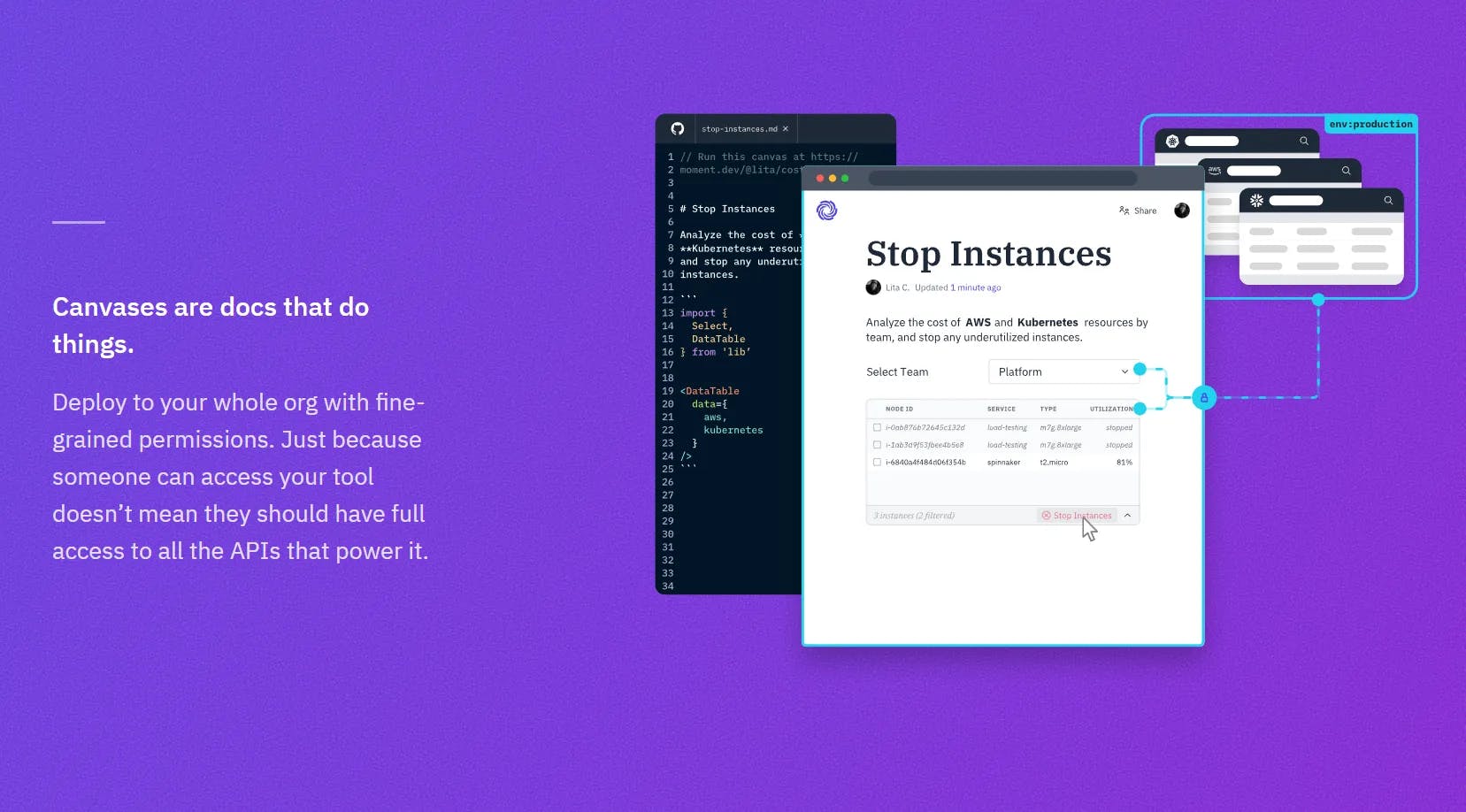
The guided product tours were done with Arcade. A big shoutout to the team building that product. It's incredibly delightful, and provided a fantastic way to show our product without the complication of recording a video.
We launched the website in late 2023 with a very positive reception.
Logo
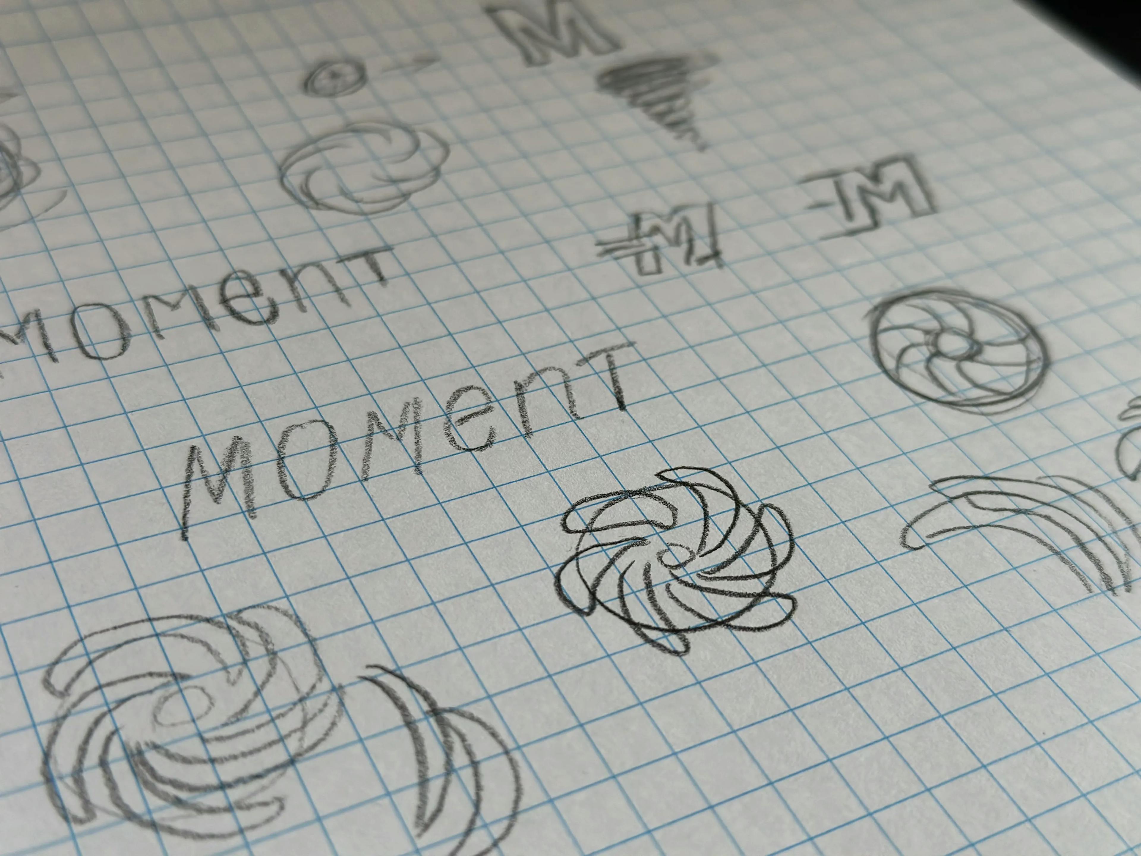
The name Moment is a reference to a physics term (the 0th moment) that refers to the amount of momentum needed to move something, such as a wheel on an axle. It is a metaphor for reducing the friction for a team to start working smoothly and quickly together.
I eventually settled on imagery that evoked a spinning wheel or whirlpool, which added some visual movement to the logo. Any similarities to OpenAI (which has become a household name since we launched this brand in early 2021) were completely unintentional.
Typography & Iconography
There were a few major considerations when selecting typography and iconography for the Moment brand. This is a brief summary of a long process that involved many different font and icon tests, but these principles drove my decision-making.
- Readability for prose and monospaced code. Moment is a text-dominant app, so readability had to come first.
- Robust selection of icons, and special characters to enable internationalization.
- Cohesive typography and iconography that feel like they fit together without too much tweaking.
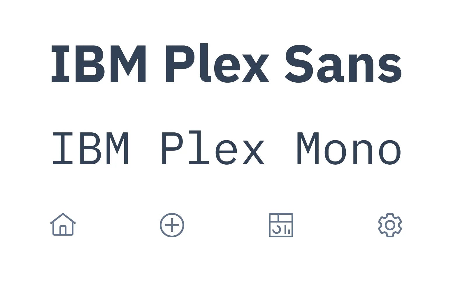
Plex, by IBM, was a natural choice to meet these requirements. It's a superfamily that contains many weights, serif, sans, and mono that are all designed to work together. On top of that, it's a part of the carbon design system which has a gigantic icon library that works really well with Plex. It's also open source!
Plex & Carbon Icons were a natural choice that I don't regret even after three years of working with them. Kudos to the IBM team for providing such an amazing resource.
Color Palette
The color palette was a difficult challenge. I needed to choose a workable color palette in the early days of the product before we had a clear vision for what the product would eventually become. Furthermore, it had to be clear enough for developers to work with, while not requiring me to be involved in every single decision. Robust documentation that wouldn't fall out of date was not a realistic possibility in the early stages of the company.
I settled on creating an abstraction layer of stable design tokens that developers could learn easily, which mapped to a set of primitives I could change as the design system evolved with the product. This diagram illustrates the process.
When the developer needs to add some UI text, they have a limited set of choices. They know it'll either be text-primary, text-secondary, or text-tertiary. A semantic:primitive mapping layer then points that semantic token to a CSS variable, which design has full control over. Those primitive CSS variables can be changed at will for each theme in the app, and the developer never has to learn anything new or refactor any code.
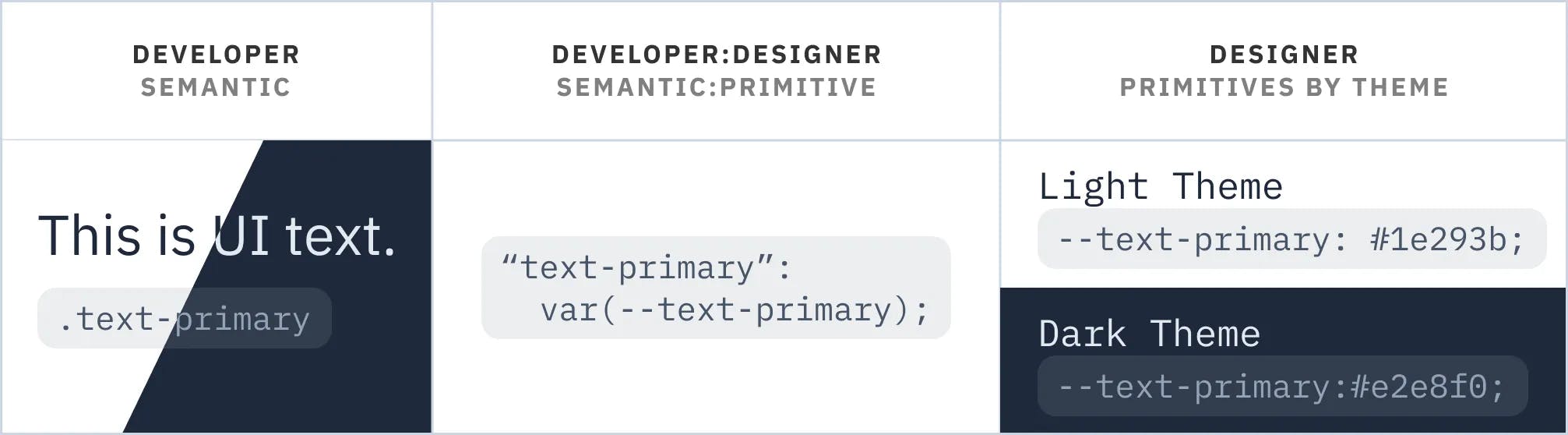
As the designer, it is much easier to control the cohesiveness of the colors while ensuring they are hitting accessible contrast ratios. Changing hex values in single file is a much simpler and less risky thing to ship than needing to change design tokens in many files. It's a system that I am very happy with, and has simplified developer & designer collaboration.
Reflections
The thing I'm most proud of through this work is designing a visual system that worked well in code. Developers were able to easily understand my intentions when translating mocks into code, while I retained full control to evolve the design language over time. This is incredibly powerful at an early stage company where things are moving rapidly and development speed is critical.